mama nous
A warm, inclusive visual identity for a children's songwriter.

Project Overview
Objective
Work with my client to develop a cohesive visual brand identity that reflects mama nous' vibe and values.
Solution
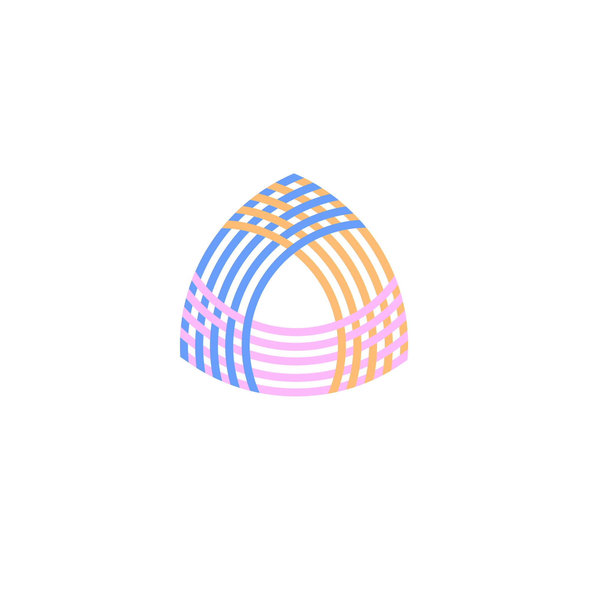
mama nous visual identity is vibrant, inclusive, and a little retro. Inspired by both music zines and by classic children's writers and illustrators like Tove Jansson and Arnold Lobel, the brand's visual identity is designed to feel warm and full of character — like a note your artsy friend doodled for you in class.


The Process
For this project, I completely overhauled mama nous' visual identity, while developing a visual language to help differentiate between the brand's different content types. I crafted a 20-page brand kit for my client, including detailed guidance on how to use the brand's logo, color palette, typography, and custom icons, shapes, and patterns, as well as how to implement these elements in both digital and print media. This kit provided mama nous with a framework that can be used to build an inviting and cohesive visual presence across all touch points.
Discovery
The first phase of this project involved visual exploration. After researching different visual styles that I thought could capture the brand's vibe and ethos, I put together a series of mood boards that I could gather feedback on from my client.
mama nous mood boards.
Please note, the images in each mood board are not owned by me and were used for research purposes only.


Experimentation
Using the mood boards I had developed as inspiration, I then began to explore different concepts for mama nous' logo. I also started developing the brand's illustrative style by creating an album cover (which would later become a stand-alone print).
mama nous logo experiments.


mama nous illustration experiments.


Implementation
Based on all of my research and experimentation, as well as the feedback I received from my client, I was able to finalize mama nous' visual identity.
mama nous writes songs guided by the principles of mindfulness and positive/gentle (re)parenting to help caretakers connect with children in ways that respect their innate emotional intelligence and resilience. Everything about the brand's visual identity is — from its warm colors and typography to its energetic logo — is designed to support these values.
Before and after: The mama nous website featuring its old branding, versus its new.


mama nous Instagram and TikTok mockups.

mama nous print and merch mockups.


Sample pages from mama nous' brand kit.


